Understanding how to effectively use color is crucial in men’s fashion, as it has the power to elevate your look. By combining the right colors, you can set the tone for your outfit. Even if the fabric and fit of an outfit are perfect, an unappealing look can result if the color balance is off.
Why Matching Color Matters?
While selecting the appropriate color combination can be difficult, with the right knowledge, it can be a fun and rewarding experience. Therefore, mastering the use of color in fashion is an important aspect to consider when aiming for a stylish and polished appearance.
Color matching brings life to your outfit. It is the final ingredient for a perfect ‘glow’. That’s why color comes first in the world of fashion.
The Color Wheel Principle
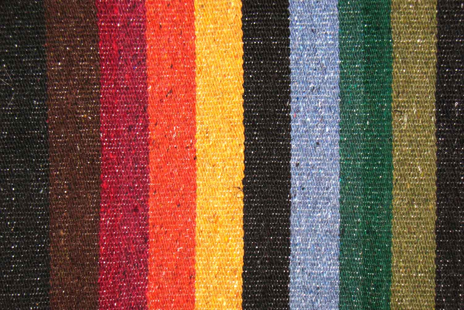
The color wheel designed by Newton comes in handy when explaining the basics of color matching.
There are three primary color schemes: monochromatic, analogous, and complementary.
The analogous color scheme
The analogous color scheme is a great option to use when you want to create a cohesive and harmonious look. It involves selecting three or more colors that are adjacent to each other on the color wheel.
An analogous scheme can be particularly useful when you want to create a subtle and understated outfit. It’s a great way to add interest and dimension to your look without being too bold or overpowering.
For example, if you are wearing a blue outfit, you could use a light blue scarf and a navy blue bag to add depth and variation to your look. The result will be a cohesive and harmonious outfit that is pleasing to the eye.
Overall, the analogous color scheme is a versatile and easy-to-use option that can work for a variety of looks and styles. It’s a great way to add interest to your outfit without overwhelming it with too many contrasting colors.
The monochromatic color scheme
The monochromatic color scheme is also an excellent option when you want to create that sophisticated and cohesive look. It involves using different shades, tints, and tones of a single color in your outfit. The main difference with the analogous color theme is the number of colors used.
The monochromatic scheme can be particularly useful when you want to create a subtle and understated outfit that still looks put-together and stylish. It’s a great option for those who prefer a minimalist or streamlined look.
For example, you could wear a light blue shirt, dark blue pants, and navy blue shoes to create a monochromatic blue outfit. Adding subtle variations in texture, such as a denim jacket or suede shoes, can add even more depth and interest to your look.
Overall, the monochromatic scheme is a simple and elegant option that can work for a variety of looks and styles. It’s an easy way to create a cohesive outfit that looks polished and intentional, without being too loud or overwhelming.
The complementary color scheme
This scheme is often used to create high-contrast outfits that stand out and make a statement. It’s a great option for those who want to create a bold and attention-grabbing look.
For example, you could pair a red shirt with green pants or a purple dress with yellow shoes to create a complementary color outfit. The contrast between the two colors creates a striking look that is sure to turn heads.
The complementary scheme is also a great option to use when you want to create a color block look, where different parts of the outfit are different colors.
Overall, the complementary color scheme is a bold and daring option that can be a lot of fun to play with. It’s a great way to create a standout look that is sure to get noticed. However, it’s important to use this scheme with care, as it can be easy to go overboard and create a look that is too overwhelming or garish.
Colors that match nicely
The color wheel puts the following colors as a great match:
- Yellow and purple
- Blue and orange
- Red and green
- Oxblood (also called temptress) and lemon
By contrast, you can tell that alternating these colors won’t go down well. However, some matching hues on the color wheel will also appear loud or bland if not mixed properly.
The key is to ensure one of the colors is in a darker shade. So, if you are matching red with green, be sure the red or green is in a dark shade.
The Kings of Colors: Universal Colors that Match Everything
The preliminary level in understanding color matching involves identifying universal colors. I call them the King of Colors because they do a home run all the time. Irrespective of the other color, pattern, or style, you can always count on these colors as easy fixes for a classy look:
- Blue
- White
- Gray
- Black
- Brown
- Red
Don’t Go There! These Colors Never Match
This category should be labeled “Don’t Do This At Home” because they are difficult to pull off. Even when you try, you will most likely look too loud or too bland.
Examples include:
- Brown and gray
- Red and orange
- Purple and blue
- Green and red
- Orange and green
- Pink and green
Achieving Class and Sophistication Through Perfect Color Synchronization
When it comes to fashion, color coordination is a key factor in achieving a polished and refined look. Here are some color combinations that can bring about a sophisticated appearance.
Dark Green and Brown
For a versatile look, brown serves as a neutral base that can complement any top. However, it’s important to choose the right shade when pairing it with dark green. To make the outfit stand out, adding an accent of a different light color is recommended.
Light Pink and Grey
Pink is not just for women! Men can also pull off this color by opting for lighter shades and wearing it as a top. Pairing it with bottom wear in white, dark gray, beige, black, tan, or black works best.
Gray blue on Blue Denim
While it may seem daunting to wear blue on blue, it’s possible to achieve a fashionable look by pairing blue denim with a complementary shade of gray blue. Introducing another universal color can also enhance the overall appeal.
White and Navy
Navy serves as an excellent base color when paired with white or light blue shades. As white is a universal color, it effortlessly brings out the best in navy.
Dark Blue and Brown
This color combination exudes class and sophistication and is a foolproof way to look sharp.
In addition to the color combinations, it’s important to consider three key factors that can influence color matching: hair color, eye color, and skin tone. Choosing color combos that complement these factors can enhance one’s overall appearance.”
Hair, Eye and Skin Tone
To achieve the perfect color coordination, it’s important to consider three key factors that can influence color matching: hair color, eye color, and skin tone. These factors can significantly impact how colors appear on an individual and can affect the overall look of an outfit.
Color psychology is the study of how colors affect human behavior and emotions. It’s essential to understand the psychological effects of colors when creating a color combination.
Red is often associated with passion, excitement, and energy. It can also signify danger or warning.
Orange is often associated with warmth, enthusiasm, and creativity. It can also signify caution.
Yellow is often associated with happiness, optimism, and sunshine. It can also signify caution or warning.
Green is often associated with nature, growth, and stability. It can also signify envy or jealousy.
Blue is often associated with calmness, trust, and loyalty. It can also signify sadness or depression.
Purple is often associated with luxury, royalty, and creativity
Pull Up and Show up!
So, when next you are stepping out, be sure to pull up and show up. Stay classy!


